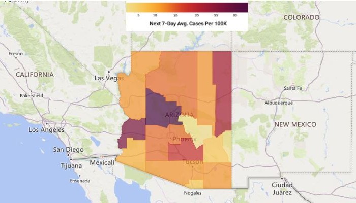
This map predicts the next COVID hotspot – Check where you live
Things are starting to look better for the U.S., as COVID-19 vaccines are steadily being distributed across the country. But just because we are making headway, it doesn’t mean that we should become complacent.
According to the CDC, we should still practice social distancing, wearing masks and washing our hands regularly. These safety precautions are important until enough people have received the vaccine and we’ve reached herd immunity. Tap or click here for insider tech tips for scheduling your COVID-19 vaccination.
It is nearly impossible to know for sure where the next outbreak will be. Fortunately, a new tool can help. It can predict possible hotspots a week in advance through algorithms and an advanced prediction model.
Here’s the backstory
Data Driven Health (DDH) has developed its own COVID-19 hotspot prediction map and claims to be 92% accurate. Using data from private and public sources, the FluDemic website can tell you where a hotspot could be in the next seven days.
Its use will go beyond COVID-19. The prediction model has been set up to track pandemics as well as other infectious diseases. DDH explains that it targets multiple populations and predicts which geographies are the most susceptible for future surges.
The tool uses clinical and non-clinical datasets fed into proprietary machine learning algorithms. It then analyzes the data and predicts potential outbreaks, socioeconomic risks and quantifies overall impact beyond viruses.
“The goal is to assist government, health system administrators, community leadership, and all people to be proactive in their decision-making through data. Our evolving real-time datasets include cases and testing, hospital preparedness and capacity, economic impacts, social risk factors, and behavioral health,” DDH explains.
How to use FluDemic
Being 92% accurate down to neighborhood level is rather impressive, but it does have some shortcomings. In sparsely populated areas, the data isn’t as accurate as heavily populated areas, so there could be some discrepancies.
Also, the data that is made available to the public for free uses a certain set of data points, but a paid-for premium version pulls data from more sources. This gives governments and local officials an increased scope, predicting down to block-level.
On the main screen of FluDemic, you have several options to choose from, but the Dashboard will give you an overall view of your area.
It will display new daily cases, total cases, new daily deaths and average cases in a seven-day period. Clicking on Explore on the right-hand side of the page, you can see the dashboard figures’ historical charts and graphs.
The Interactive Map is where the prediction model comes in.
- Navigate the map to your city. (Note: The site asks to know your location. Select allow and it zooms into your area automatically.)
- On the right-hand side, make sure that your Country and State are correct.
- Select your County from the drop-down.
- Click on Apply Criteria.
- Below that, select which seven-day metric you want to see.
- Click Animate.
The website will take a few seconds to get all the data and will proceed to show you how (if any) the virus will spread over the next seven days. Here is a screenshot for the Phoenix area over the next seven days:

Using the AI predictive model, the figures at the top of the page will also change to reflect the predictions. This will include total deaths, the increase in daily new cases and the average seven-day cases.
Keep Reading
Don’t fall for this COVID-19 vaccine misinformation
COVID vaccine: Use this site to see when you’re eligible
Tags: misinformation, vaccination
