Help Microsoft pick a new default font for Office
It’s time to kiss Calibri goodbye. For the first time in 15 years, Microsoft is changing its default Office font. Next year, it will have a completely new look — and you could even choose it.
That’s because Microsoft commissioned five potential new looks. Instead of leaving the decision-making to corporate, the company’s asking users like you to share their thoughts on social media. Give feedback and comment on social media, and your favorite fonts could be the future face of Microsoft Office.
Although Office Suite is the golden standard for digital office software, it’s got a huge price tag. Tap or click to find out how you can use Microsoft Office for free. In the meantime, here’s how to play a role in Microsoft’s future.
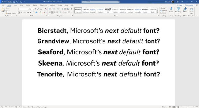
First up: Here are the fonts you can choose from
The best default fonts fly under the radar. When they blend into the background, you can get straight to your work with no distractions.
At least, that’s what Microsoft thinks. “A default font is often the first impression we make,” the company said in a recent blog post. “It’s the visual identity we present to other people via our resumes, documents, or emails.”
That’s why the tech giant is saying goodbye to its old font. Calibri stole the show back in 2007 when it replaced Times New Roman across Microsoft Office apps. Now its reign is over, and five new contenders are competing for the throne.
Here’s what they look like:

These new fonts are the work of different designers. Some worked in teams, while others created the new looks by going solo.
Each typeface has its own story
For example, Steve Matteson designed Bierstadt to mimic mid-20th-century Swiss typography. While it has subtle softening designs, its stroke endings cut off clearly. It’s reminiscent of Helvetica and Arial.

He named it after Mount Bierstadt, a 14,000-foot mountain in Colorado. “When I think of Swiss type, I think of the Alps,” he told Microsoft. “Since I’m based in Boulder, my Alps are the Rockies.”
YOU WON’T BELIEVE THIS: The story of how a font foiled a forging attempt
Another font design you can choose from also has European inspiration. That’s Grandview, a striking design from Aaron Bell, who found inspiration in Germany’s classic roads and railway signs.

These iconic signs are designed to be easily legible under poor conditions or from far away. Bell thought they would translate well onto the computer screen, although he tweaked some letters for long-term reading.
All of these designs are now available in Microsoft 365’s font menu. That means you can play with them before choosing your favorite.
Once you pick the font you’d like as the new default, you can share your thoughts on social media. There might even be polls and other ways to share your feedback. After Microsoft picks its winner, it will pop up as the default font in Office apps in 2022.
Speaking of Microsoft Office, did you know there’s a powerful program that works similarly? The only difference is that you avoid the high cost. Tap or click here for a free alternative to Microsoft Office.
Tags: alternatives, applications (apps), computers, cost, design, feedback, fonts, Microsoft 365, program, social media
