Online calculator predicts your risk of dying from COVID-19
May 14, 2020
By Kim Komando
One of the strangest things about COVID-19 is how widely the symptoms of the virus vary from one person to another. For the most part, seniors are the largest risk group for complications but that hasn’t stopped the disease from claiming the lives of healthy young people.
While the vast majority of cases are mild or asymptomatic, there are certain telltale signs to look for that point to a worse infection. Tap or click here to see the COVID-19 symptoms to look out for.
But rather than guess, wouldn’t it be better if we knew what our individual risks were before going outside and potentially exposing ourselves to the virus? Well, this new calculator created by U.K. researchers takes your health stats into account and paints a clearer picture of your risk of complications. Here’s how you can find out.
Can you survive COVID-19?
The risk factors for COVID-19 can vary depending on personal health, age, and mitigation efforts from local governments. While some guides online might take these issues into account, very few crunch the raw data from real infection cases to paint a more accurate picture of the crisis.
But that’s where OurRisk.CoV comes in. This online calculator was created by researchers from University College London (UCL), UCL Hospitals NHS Trust, the University of Cambridge and Health Data Research U.K. It draws from a data pool of more than 3.8 million health records from patients in England — making its calculations more accurate.
What this calculator will not tell you, however, is how prevalent the virus is spreading in your area. You’ll need a localized map to get a better picture of the situation on the ground. Tap or click here to see the COVID-19 map you should set as your homepage.
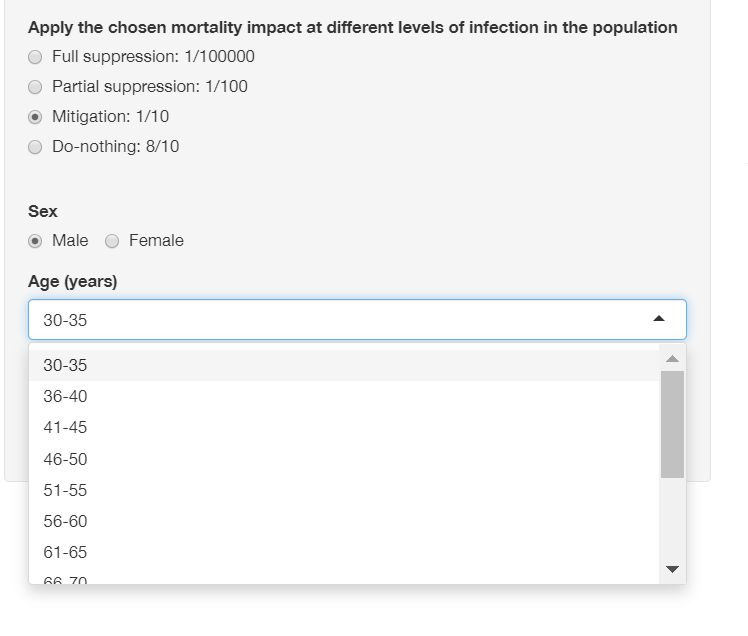
When you first boot up the calculator, you’ll see a sliding scale of the mortality impact, as well as adjustable factors like local mitigation efforts, sex, age and underlying health conditions. If you enter your information, you’ll see the excess mortality rates for people in your risk group compared to the majority — as represented by the green chart.
As for pre-existing conditions, the biggest risks come from chronic lung conditions like COPD, diabetes, cardiovascular disease, kidney disease and high BMI.
Curiously, if you try to input an age lower than 30, there isn’t an option. This shows how minimal the risk appears to be for young people, who die at a far lower rate on average than seniors and at-risk groups.
Can I trust what this calculator says?
Once again, this calculator shows your risks, but it’s not an exact science. The data you put into the calculator is weighed against healthcare data from the U.K., and that paints a picture of what the situation is like for hospitals there.
At the same time, it does give you a clearer idea of whether you’re better off cutting your risks by wearing protective gear and avoiding public areas. This will become even more important as states begin to reopen across the country. Tap or click here to see when your state should reopen.
If you’re brave enough to see where your risk lies, go ahead and try the calculator out. It doesn’t ask for personally-identifying information like your name or email, so you can feel comfortable sharing a bit of information about your health situation. In any case, it’ll help people get a clearer idea of how safe they are with the virus circulating.
You might not be able to see it, but that doesn’t mean it isn’t still there. Stay safe, and stay vigilant.
https://www.komando.com/tips/software-and-apps/online-covid-19-risk-calculator/

