The 5 best maps and tools for tracking the coronavirus spread
April 7, 2020
By Mark Jones
We’re nearing the 1.5 million infected worldwide mark in the spread of the novel coronavirus. As infected numbers grow and the death toll mounts, we’re all desperate for reliable information.
That starts with ignoring conspiracy theories and fake prevention tips. Avoiding germs is key to staying healthy. You’re washing your hands more, and it’s a great time to clean up your devices, too. Tap or click here for the best ways to disinfect your phone.
Like most people worried about COVID-19, you’ve probably done some research online to stay informed. But be careful. Navigating the internet for accurate information can be tricky. Here are five trustworthy online coronavirus tools we’re relying on.
1. Best online map to track COVID-19
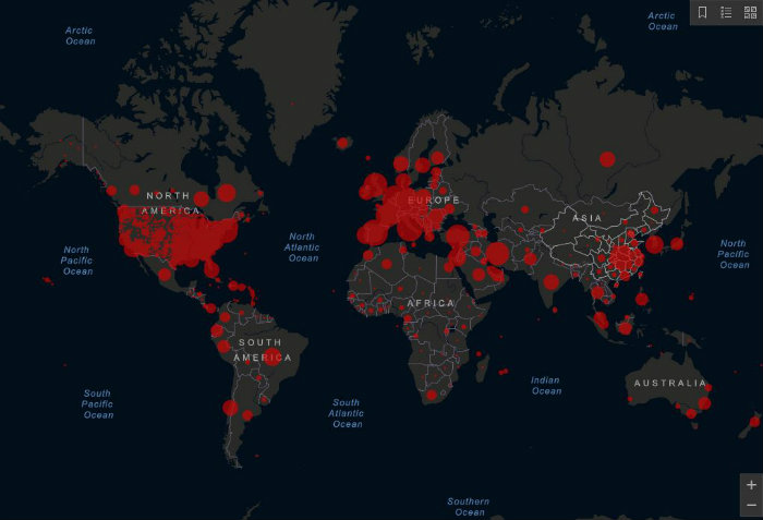
If you want to track the spread of coronavirus across the globe, look no further than the digital map hosted by Johns Hopkins University. This easy to use map shows, by country, how many people are infected, recovered and dead by country — giving a true look at the scale of the pandemic.
This COVID-19 Global Case Tracker takes data from 17 sources, including the World Health Organization, governments across the globe and the European Centre for Disease Prevention and Control.

The map lists all confirmed COVID-19 cases, as well as the current rate of progression and fatalities. As of now, the number of confirmed cases in the U.S. is steadily growing, so you’ll want to keep an eye on it as time goes by. Tap or click here to see the live map. If there’s one map to bookmark, this is it.
You may also like: DIY face mask can help protect against coronavirus
2. How many people have coronavirus in your state?
The COVID Tracking Project collects information from 50 U.S. states, the District of Columbia and five other U.S. territories to provide the most comprehensive testing data for SARS-CoV-2. It gives a more in-depth look at what’s happening with the virus in your area.

The tracker includes positive and negative results, pending tests and total people tested for each state or district. You can find all the collected data at covidtracking.com/data.
Visit the site to find the most recent testing information from your state and other areas around the country. According to the COVID Tracking Project, all the information comes from state, district or territory public health authorities and on occasion, from trusted news sources.
3. Detailed hospital capacity projections
One of the main reasons it’s so critical to slow the spreading of COVID-19 is to relieve the strain on hospitals around the country, which just don’t always have the staffing or available resources to care for a huge spike in patients at the same time. If we can all pitch in to help flatten the curve, it will take some of the burdens off hospitals and that could help save lives.
Along those lines, a new online resource is COVID ActNow. Its projections show when hospitals will likely become overloaded, and what you can do to help stop the spread COVID-19.
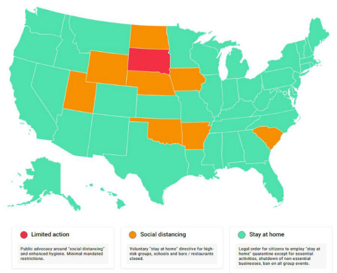
At covidactnow.org, you will see a national map that shows how each state is responding to the coronavirus currently. Each state falls into three categories.
- Limited action – Public advocacy around social distancing and enhanced hygiene. Minimal mandated restrictions.
- Social distancing – Voluntary stay at home directive for high-risk groups. Schools and bars/restaurants are closed.
- Stay at home – Legal order for citizens to employ stay at home quarantine except for essential activities, a shutdown of non-essential businesses, ban on all group events.

Once you’re on the covidactnow site, type in your city, county or state in the search box on the main page for local information. You’ll see a graph with projected hospitalizations for your state with best and worse case scenarios. Slide your cursor over the graph’s timeline to see specific numbers by date.
The data for COVID ActNow comes from the Johns Hopkins Center for Systems Science and Engineering’s Coronavirus Tracking Dashboard (mentioned above) and is updated daily.
You may also like: Watch out for these fast-spreading coronavirus scams
4. Community movement during COVID-19
Google has put together a tool that tracks how movement within communities across the globe has been impacted by COVID-19.
With most states recommending social distancing and staying home unless you need to leave for an essential service, you’d think traffic would be way down everywhere. That’s not always the case.
Now, you can look at Google’s Community Mobility Reports to see how well your community is doing with social distancing, or how poorly. These reports aim to provide insights into what has changed in response to policies designed to combat COVID-19.
They track movement trends over time by geography, across different categories of places such as retail and recreation, groceries and pharmacies, parks, workplaces, transit stations and residential areas. After navigating to the tool by clicking here, scroll down to the list of regions and tap United States. From here, find the state that you’re interested in and download the PDF next to it.

You’ll find tons of helpful information including movement across the different categories. Plus, it will breakdown the numbers for each county in the state.
What about your privacy? Yes, Google is using your location data but according to the company, “No personally identifiable information, such as an individual’s location, contacts or movement, will be made available at any point.” The company’s privacy promise goes on to say that these reports are created with aggregated, anonymized sets of data from users who have the Location History setting turned on. That setting can also be turned off.
5. Preparing for the worst
Researchers from the University of Washington’s Institute for Health Metrics have created a tool that predicts health service utilization and deaths due to COVID-19 by day for the next 4 months. It includes information for each U.S. state and the numbers are shocking.
The study used data from the World Health Organization and local and federal governments. It projects not only the number of estimated deaths but also the demand for hospital services, including the availability of ventilators, regular hospital beds and intensive care unit (ICU) beds.
These projections are based on the assumption that social distancing will continue until the end of May 2020. In locations without social distancing measures currently in place, researches assumed they will be in place within seven days of the last model update. If not, the number of deaths and the burden on hospital systems will be higher than projected.
If you want to see the numbers for your state, go to covid19.healthdata.org/projections. Once you’re on the site you’ll see a drop-down box with the words “United States of America” inside. Click on that box and scroll until you find your state.

The page will update with local charts showing hospital resource use, deaths per day and total deaths. For each chart, you can hover your cursor over the graph to see data for specific days. Move it left or right to get that day’s information.
Use the tools we’ve mentioned here to stay updated with the latest COVID-19 intel. For more information, stick with trusted sources like the CDC and WHO, and we’ll make it through this together. Stay safe out there, and don’t forget to wash your hands!
https://www.komando.com/tips/software-and-apps/the-5-best-maps-and-tools-for-tracking-the-coronavirus-spread/